
- Apps


 Easy Bundle ‑ Product Builder
All-In-One bundle builders
 Qe Slider ‑ Carousel Slider
Elevates Revenue with Slick Slider
 Qe Seasonal Effects & Decor
Add Festive Seasonal Decorations
 Qe Quick Link Redirect
Fix Broken Links Effortlessly
 Qe Frequently Bought Together
Boost Sales with Smart Upsells
 QeApps ‑ Mobile App Builder
No-code Mobile App Builder
 Qe Product Compare
Allowing Shoppers to Compare Items
 Qe Multiship
Ship Items to Multiple Addresses
 Discount Bulk Volume Quantity
Create Custom Product Bundles
 Sticky Cart+ Fly Cart
Add Fly-to-Cart Animations.
 QeCart ‑ Slide Out Cart
Add Dynamic Slide-out cart
 Qe Speechify | Voice Search
Seamless Voice Search Functionality
 Qe FAQ Page & Product FAQs
Customizable Product FAQs
 ATC Button Animation
Add to Cart Button Animations

Explore Our Shopify Apps to Grow Your Store
- Check Our Apps


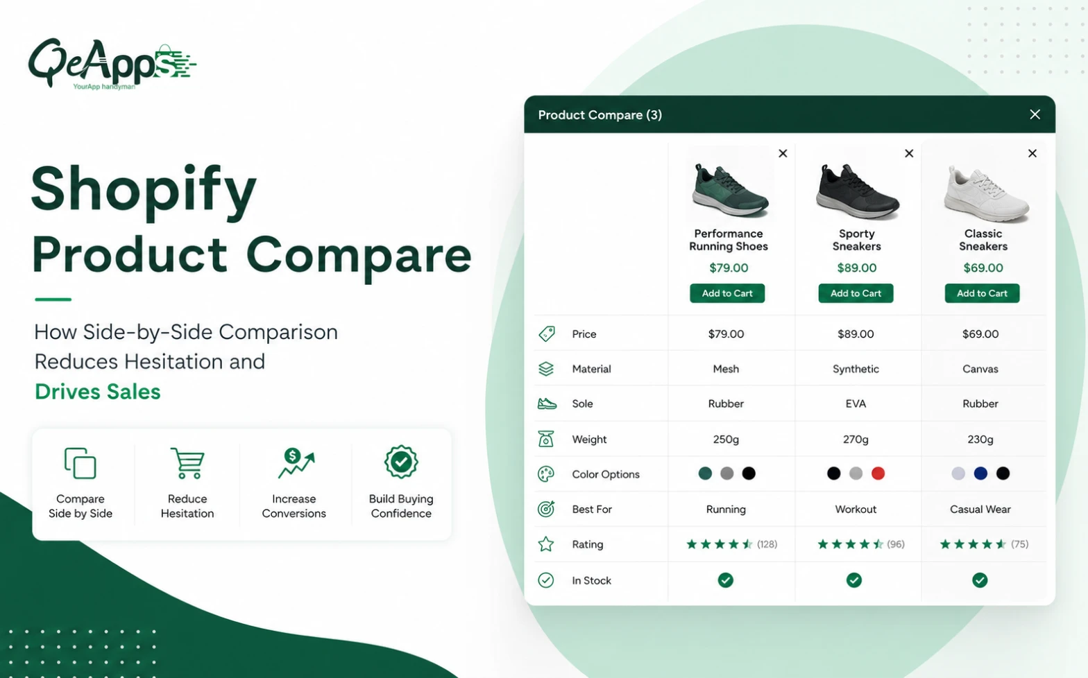
Comparison shopping is now a standard part of the ecommerce buying journey. Most shoppers do not commit to a product after viewing a single page; instead, they cross-reference two or three alternatives, checking price, specifications, and fit before deciding. When that process takes too much effort, many simply abandon the purchase, not because the product was wrong for them, but because comparing it to the alternatives demanded more work than they were willing to give.
This is exactly where Shopify Product Compare earns its place on a store. Instead of asking customers to build their own mental spreadsheet, a comparison tool lays the differences out for them, side by side, in one view. For catalogues with overlapping products or detailed specifications, that single change often decides whether a visitor buys or bounces.
Why Shoppers Hesitate Before Buying
Hesitation rarely comes from a bad product. Instead, it comes from uncertainty about which product is right.
When two items look similar, a description here and a spec sheet there, the shopper has to do the comparison work manually. They must remember what the first product offered while reading the second, then repeat that for a third. Every extra tab is a chance for attention to drift.
Google’s research into purchase decision-making found that shoppers rely on mental shortcuts, called category heuristics, to manage this complexity. Because short, clear specifications simplify a decision, the easier it is to see what separates one product from another, the faster a shopper commits. Without that clarity, buyers either abandon the purchase or buy the wrong item and return it later.
Quick Insight
Shoppers rarely abandon a purchase because they dislike every option. More often, they simply cannot tell which option is theirs.
Why Shopify Product Compare Matters More Than Ever
Comparison behaviour is not limited to electronics shoppers. It is standard practice across nearly every category with more than one viable option on the page.
Baymard Institute’s Product Page UX benchmark, drawn from over 30,000 manually scored usability observations, found that only 48% of leading ecommerce sites achieve a “decent” or “good” Product Page UX, with up to 62% falling into “mediocre” or worse. As a result, test participants often abandoned suitable products during usability testing purely because of resolvable UX issues, not because the product itself was wrong.
A comparison feature closes that gap directly. It reduces decision fatigue by placing the deciding details in one place. It also builds buying confidence, because shoppers can see, not guess, what fits their needs best. Consequently, stores often see fewer “this isn’t what I expected” returns once comparison is available.
Where Product Compare Works Best
Side-by-side comparison earns its keep wherever shoppers weigh similar-looking products against each other:
- Fashion and apparel: fabric, fit, and sizing across similar styles
- Electronics and accessories: battery life, ports, and warranty terms
- Furniture and home décor: dimensions and materials
- Beauty and supplements: ingredients and formulation differences
- Jewellery: metal type and stone quality
- Industrial tools and automotive parts: technical specifications and fitment
The common thread is high consideration. Wherever a purchase cannot be easily undone, comparative behavior naturally follows.
Common Mistakes and Best Practices
Not every comparison attempt actually helps. A few recurring mistakes undo the benefit: too many open tabs left for the shopper to manage, specifications hidden inside long descriptions, no comparison option despite a catalogue full of near-duplicate variants, and a poor mobile experience that forces constant scrolling.
Instead, a comparison feature performs best when it stays disciplined:
- Limit comparisons to three or five products at once, so shoppers avoid new choice overload
- Design for mobile first, since most Shopify traffic now arrives on phones
- Keep attributes consistent across every compared product
- Make the “add to compare” action visible on the collection page, not buried in menus

Introducing Qe: Product Compare
This is precisely the gap Qe: Product Compare, built by QeApps, was designed to close. Here’s what it actually does:
- Comparison drawer: Adds a comparison drawer to the right-hand side of the storefront, so shoppers keep their place in the browsing session instead of being sent to a separate page.
- Flexible product selection: Store owners can pre-select which products appear or let customers build their own comparison list from the collection page.
- No-code setup: Activates through Shopify’s App Embeds with no coding required.
- Bulk-friendly data: Product data can be imported or exported through CSV, which is useful for catalogues with hundreds of SKUs.
- Custom fields: Merchants can define custom labels, attributes, and icons to highlight whatever matters most, whether that’s fabric, battery capacity, or warranty length.
- Native field control: Choose which native fields (title, price, description, type, vendor) appear in the drawer.
- Adjustable design: Button styling and comparison limits, typically four to five products at once, can be matched to the brand.
- Two pricing tiers: Basic, at $4.95 a month, covers auto compare products, custom labels, language settings, and email support. Premium, at $8.99 a month, adds metafields support for comparison, auto compare visibility, and import/export for auto compare. Both include a 7-day free trial.
None of this replaces good product photography or clear descriptions. Instead, it removes the manual work a shopper would otherwise do themselves, tab by tab, to figure out which product actually fits.
Quick Insight
If customers keep comparing the same two products, that pairing is telling you something about how your catalogue is actually being shopped.
Real Business Benefits
Merchants who add structured comparison typically see the impact across a few connected areas:
- Reduced hesitation at the point of decision
- Faster purchase decisions, since attributes are laid out consistently
- Better conversion quality, with fewer cancelled or uncertain orders
- Lower product confusion across sizes, bundles, or near-identical variants
- Improved product discovery, since a comparison list often introduces a second product
- A potential reduction in returns, since customers confirm fit before checkout
Quick Insight
A comparison feature does some of its best work quietly by reducing “wrong item” returns before they happen.
Bringing It Together
Comparison shopping is not a niche behaviour. It is how most shoppers navigate any catalogue with more than one reasonable option, and a store that makes that comparison easy keeps its visitors’ attention long enough to convert them.
Shopify Product Compare gives merchants a structured way to support that behaviour, rather than leaving customers to do the work alone, tab by tab. For stores with overlapping products or frequent “what’s the difference” questions in support, it is a practical addition rather than a full redesign. It is also worth checking your own catalogue first. Wherever two products sit side by side in a collection and share more similarities than differences, comparison shopping is already happening in your customers’ heads, whether your store supports it or not.
Quick Insight
A comparison feature does some of its best work quietly by reducing “wrong item” returns before they happen.
Bringing It Together
Comparison shopping is not a niche behaviour. It is how most shoppers navigate any catalogue with more than one reasonable option, and a store that makes that comparison easy keeps its visitors’ attention long enough to convert them.
Shopify Product Compare gives merchants a structured way to support that behaviour, rather than leaving customers to do the work alone, tab by tab. For stores with overlapping products or frequent “what’s the difference” questions in support, it is a practical addition rather than a full redesign. It is also worth checking your own catalogue first. Wherever two products sit side by side in a collection and share more similarities than differences, comparison shopping is already happening in your customers’ heads, whether your store supports it or not.
Quick Insight
If your support inbox regularly gets “what’s the difference between X and Y” questions, your shoppers already want a comparison view.

Frequently Asked Questions
Q.1 What is Shopify Product Compare?
It’s a store feature that lets shoppers view two or more products side by side, comparing prices and specifications in one panel instead of switching between pages.
Q.2 Does a comparison feature actually improve conversions?
It supports conversions indirectly. When shoppers confirm which product suits them faster, they hesitate less and are less likely to abandon the decision.
Q.3 How many products should a comparison table show?
Most stores get the best readability with three to five products. Beyond that, the comparison itself becomes another source of choice overload.
Q.4 Does it require custom development to set up?
Not with a dedicated app. Qe: Product Compare activates through App Embeds with no coding required and supports CSV import and export.
Q.5 Which categories benefit most from comparison tools?
Categories with detailed specifications or near-identical variants benefit most, including electronics, furniture, beauty, jewellery, and industrial tools.
Related Blogs





 [email protected]
 +91 95747 42204
 9th Floor, Solitaire Connect, Near Gallops Motors, SG Highway, Ahmedabad, Gujarat 380015


