
- Apps


 Easy Bundle ‑ Product Builder
All-In-One bundle builders
 Qe Slider ‑ Carousel Slider
Elevates Revenue with Slick Slider
 Qe Seasonal Effects & Decor
Add Festive Seasonal Decorations
 Qe Quick Link Redirect
Fix Broken Links Effortlessly
 Qe Frequently Bought Together
Boost Sales with Smart Upsells
 QeApps ‑ Mobile App Builder
No-code Mobile App Builder
 Qe Product Compare
Allowing Shoppers to Compare Items
 Discount Bulk Volume Quantity
Create Custom Product Bundles
 Sticky Cart+ Fly Cart
Add Fly-to-Cart Animations.
 QeCart ‑ Slide Out Cart
Add Dynamic Slide-out cart
 Qe Speechify | Voice Search
Seamless Voice Search Functionality
 Qe FAQ Page & Product FAQs
Customizable Product FAQs
 ATC Button Animation
Add to Cart Button Animations

Explore Our Shopify Apps to Grow Your Store
- Check Our Apps


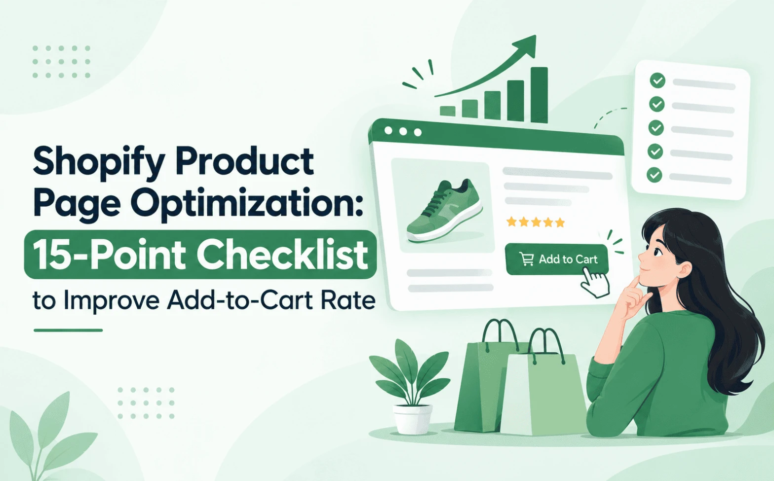
A shopper lands on your best-selling jacket, scrolls twice and leaves. Your traffic looks healthy, but your add-to-cart numbers do not. This gap is where Shopify product page optimization pays off, because the product page is where interest becomes a decision.
Most stores do not need a full redesign. They need a few small fixes that remove doubt. This guide covers 15 of them, with examples from fashion, beauty, electronics and home decor.
Why Shopify Product Page Optimization Matters
Nearly every shopper views a product page before buying, so it carries the final decision. Yet Baymard Institute’s 2026 benchmark found that 62% of leading mobile ecommerce sites have “mediocre” or worse product page UX (Baymard Institute, Product Page UX 2026, updated March 2026). Baymard also observed shoppers abandoning suitable products because of fixable usability problems.
So the gap is rarely the product. It is the page around it.
Quick Insight
Baymard notes that a pile-up of medium-level issues, not one big fault, more often drives shoppers away.
The 15-Point Shopify Product Page Optimization Checklist
Use this Shopify product page optimization checklist as a quick audit.
1. Write Product Titles That Explain What You Are Selling
“Classic Tee” tells shoppers very little. Add the product type, material or key attribute, such as “Organic Cotton Relaxed-Fit T-Shirt”. A specific title confirms relevance and matches how people search.
2. Make the Price and Offer Easy to Understand
Show the current price near the title. Use a genuine compare-at price for sales, and state conditions beside it, such as “10% off orders over $50”. If shoppers must hunt for the real cost, they hesitate.
3. Use High-Quality Product Images From Multiple Angles
Shoppers cannot touch your product, so images do that job. Keep backgrounds consistent and add close-ups of texture or stitching. A beauty store can show swatches on different skin tones. A furniture store can show items beside everyday objects.
4. Add Product Videos Where They Help Explain the Product
Use short clips only when they answer a question. A 15-second video can show how a jacket moves or how a gadget connects.
5. Make Product Variants Easy to Select
Show sizes and colours as visible buttons or swatches. Baymard’s testing found that shoppers can miss an unavailable size until they open a drop-down menu. Label options clearly, and swap the image when a colour is chosen.
6. Display Stock Availability Clearly
Mark sold-out sizes on the selector itself, and offer a back-in-stock option if your theme supports it. Accurate availability prevents disappointment.
Quick Insight
Test size and colour selectors on a phone. Availability should be obvious at a glance.
7. Write Product Descriptions That Answer Buying Questions
Open with what the product does and who it suits. Then cover materials, dimensions, care and what is in the box. Strong Shopify product descriptions read like help, not hype.
8. Highlight Benefits Instead of Listing Only Features
A feature is “5,000 mAh battery”. A benefit is “powers a full weekend away”. Pair each specification with its practical value. Fragrance-free suits sensitive skin.
9. Make the Add-to-Cart Button Easy to Find and Understand
Use one primary button with clear wording, such as “Add to cart”, in a contrasting colour. On mobile, keep it within thumb reach. Remove competing buttons nearby. Then confirm the action with a cart update, and consider motion cues like those in ATC Button Animation. Details like these matter for Shopify add-to-cart button optimization.
10. Show Shipping, Delivery and Return Information Before Checkout
Place delivery estimates, shipping charges and the return window beside the buy button. Baymard’s research reports that 60% of shoppers look for return policy details on the product page. A short summary with a link to the full policy works well.
Quick Insight
Keep the shipping cost and return window within one scroll of the buy button.
11. Build Purchase Confidence With Genuine Customer Reviews
Show star ratings near the title and full reviews lower down, ideally with customer photos. Keep critical reviews visible and reply politely. Never publish fake or purchased reviews.
12. Add Trust Signals and Relevant Payment Information
Show accepted payment methods, secure checkout notes and genuine guarantees near the buy button. Choose two or three badges that are true and relevant. A wall of logos adds clutter and weakens the message.
13. Answer Common Product Questions Directly on the Page
Add FAQs, size guides, compatibility notes and usage instructions below the description. Qe FAQ Page & Product FAQs offers customizable product FAQs for this. Clear question-and-answer content also gives search engines and AI assistants material to interpret, and Google’s product structured data guidance explains how to mark up price and availability for Shopify product page SEO.
14. Test Mobile Layout and Page Speed on Real Devices
Check your page on actual phones, not only a desktop preview. Use readable text, large tap targets and compressed images. Run Google PageSpeed Insights on product URLs, and remove scripts you no longer use. This is the core of Shopify mobile product page optimization.
15. Help Shoppers Rediscover Products They Have Already Explored
A recently viewed section keeps that browsing trail visible. Qe Recently Viewed shows previously explored products in a responsive carousel across product, homepage and collection pages. A sliding drawer lets shoppers check details, choose a variant and add to cart instantly. Promotional and discount badges appear in the drawer, and an optional Best Seller section is available.
You can customize the slider title, colours, image size, display range and slider style. Setup is no-code through the Shopify Theme Editor, the layout is mobile-friendly, and the app carries the Built for Shopify badge. See how to add recently viewed products in Shopify for the steps.

Recently viewed products are not recommendations. Recommendations introduce new items, while this section returns shoppers to items they already explored.
Quick Insight
Remember: recently viewed brings shoppers back to what they chose, while recommendations introduce what they have not seen yet.
How to Measure Shopify Product Page Optimization Results
Six metrics are worth watching:
- Product page add-to-cart rate: product page sessions with an add-to-cart.
- Product conversion rate: product page sessions that end in a purchase.
- Reached-checkout rate: cart additions that progress to checkout.
- Product page engagement: scroll depth, image views and variant clicks.
- Mobile versus desktop: behaviour often differs between the two.
- Cart abandonment: carts created but not completed.
Add-to-cart rate = (Product add-to-cart events ÷ Product page sessions) × 100
Keep the denominator and method the same when comparing periods, or you will chase differences that are not real.
Conclusion: Remove Hesitation to Increase Add-to-Cart Rate on Shopify
Shopify product page optimization is about removing hesitation, one question at a time. Review your pages with this checklist, fix the two or three gaps that stand out, and measure the result. No fix guarantees a specific lift, but each one makes buying easier.
To help shoppers return to products they explored, Qe Recently Viewed is a practical next step. Install it from the Shopify App Store, or browse more tools from QeApps in the Shopify App Store.

Frequently Asked Questions
Q.1 How do I optimize a Shopify product page for conversions?
Start by removing doubts. Make titles specific, show clear pricing, add sharp images, and place shipping and returns near the buy button. Then make variants and the add-to-cart button easy to use on mobile. Change one element at a time and compare results against your own baseline.
Q.2 What is a good add-to-cart rate for a Shopify store?
There is no universal benchmark. Rates vary by industry, price point, traffic source and device. Measure your own add-to-cart rate over time, split by mobile and desktop, and judge success by improvement against that baseline. A store selling premium items may see different rates from one selling low-cost accessories.
Q.3 Which elements are most important on a Shopify product page?
Clear images, an accurate price, easy variant selection and a visible add-to-cart button matter most. Close behind are a helpful description, shipping and return details, genuine reviews and answers to common questions. The right order depends on your products and customers, so test it.
Q.4 How can I improve the add-to-cart rate on mobile?
Keep the buy button within thumb reach and use large, tappable variant options. Compress images, test on real phones and cut unused scripts so the page loads quickly. Show delivery and returns in short blocks, and keep pop-ups from covering the buy button.
Q.5 Do recently viewed products help Shopify stores improve product discovery?
They can make it easier for shoppers to revisit items they already explored, which supports comparison and rediscovery. They do not replace product recommendations, which suggest new items. Both can sit on the same store, and results vary, so track your own metrics.
Related Blogs





 [email protected]
 +91 95747 42204
 9th Floor, Solitaire Connect, Near Gallops Motors, SG Highway, Ahmedabad, Gujarat 380015


