
- Apps

 Easy Bundle ‑ Product Builder
All-In-One bundle builders
 Checkout Blocks & Customizer
Checkout Customization
 Qe Slider ‑ Carousel Slider
Elevates Revenue with Slick Slider


 Qe Seasonal Effects & Decor
Add Festive Seasonal Decorations
 Qe Quick Link Redirect
Fix Broken Links Effortlessly
 Qe Frequently Bought Together
Boost Sales with Smart Upsells
 QeApps ‑ Mobile App Builder
No-code Mobile App Builder
 Qe Product Compare
Allowing Shoppers to Compare Items
 Qe Multiship
Ship Items to Multiple Addresses
 Discount Bulk Volume Quantity
Create Custom Product Bundles
 Sticky Cart+ Fly Cart
Add Fly-to-Cart Animations.
 QeCart ‑ Slide Out Cart
Add Dynamic Slide-out cart
 Qe Speechify | Voice Search
Seamless Voice Search Functionality
 Qe FAQ Page & Product FAQs
Customizable Product FAQs
 ATC Button Animation
Add to Cart Button Animations

Explore Our Shopify Apps to Grow Your Store
- Check Our Apps


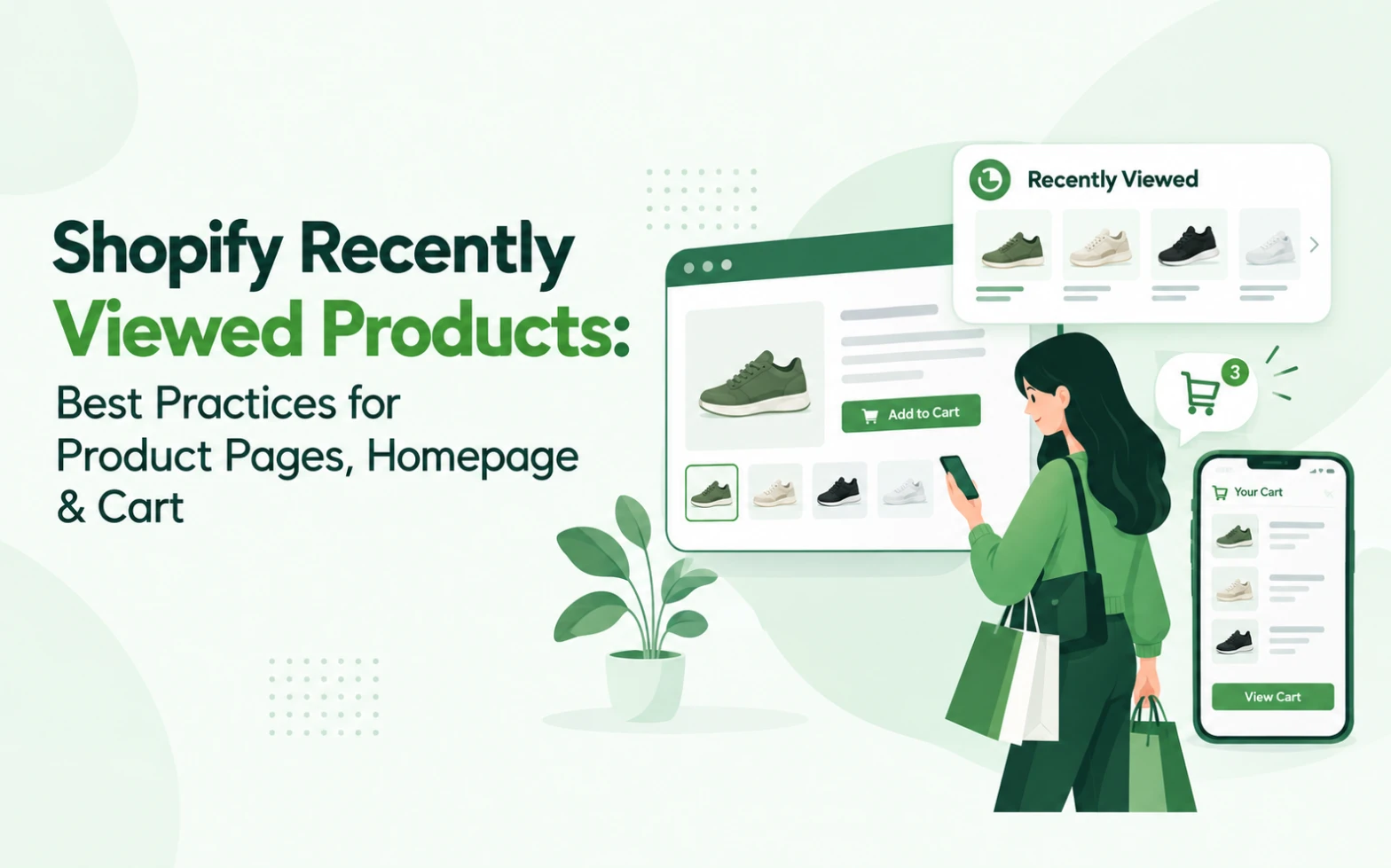
A shopper opens three product pages in a row, compares them, gets distracted, and drifts over to the homepage. Or they add one item to the cart, keep browsing, and never quite decide on the second. In both cases, the shopper hasn’t left. They’ve just lost the thread, and closing that gap usually comes down to Shopify recently viewed products best practices: knowing exactly where the section should sit and what job it should do on each page it appears on.
Most Shopify merchants already understand what recently viewed products are. Fewer have worked through where the section belongs on the product page, homepage, and cart, and why those three placements shouldn’t do the same job. That’s the question this blog answers.
Why Recently Viewed Placement Matters on Shopify
The same recently viewed widget behaves differently depending on where a shopper meets it. On a product page, it’s a comparison tool: the shopper is already deciding, and the section helps them weigh options side by side. On the homepage, it’s a re-entry point: the shopper has no specific product in mind yet, and the section reconnects them with items they’d already flagged as worth a second look. In the cart, it’s a recall tool, useful in some stores and distracting in others, depending on how focused the checkout journey needs to be.
None of these placements automatically lifts conversions. What they do is remove a specific kind of friction: relocating something the shopper already found once. Placement should follow shopper intent on that page, not an assumption that more visibility is always better.
Quick Insight
The same carousel isn’t three different features. It’s one feature doing three different jobs, and only one of those jobs sits close to checkout.
Recently Viewed Products on Product Pages
Product pages are usually the strongest placement, and for a specific reason: this is where comparison shopping actually happens. A shopper weighing three variations of a jacket, or two similar chairs, benefits from having all of them visible again without retracing collection pages or rebuilding a search from memory.
A few practical points for this placement:
- Position the section after core product information and the add-to-cart button, not above it.
- Keep product cards compact: image, name, price, and relevant variant detail.
- Cap the number of items shown; recognition matters more than depth here.
- Design for mobile first, since most Shopify browsing sessions happen there.
It’s also worth separating this section clearly from recommended or related products. Recently viewed shows what the shopper actually looked at. Recommendations show what the store predicts they’ll want next. The first is rediscovery, the second is discovery, and merchants who blend the two into one carousel usually confuse shoppers about why a given product is showing up at all.
Recently Viewed Products on the Homepage
The homepage works differently. A shopper landing there, especially a returning visitor arriving through direct traffic or a bookmark, doesn’t have a specific product open. Recently viewed products give that shopper a way back into their previous session without starting the search over, which matters most for larger catalogues and stores with many collections.
Placement should sit after the primary merchandising message, not above it. Hero banners, new arrivals, and key category entry points still deserve top billing; recently viewed products work well as a supporting section further down. Exactly where it lands depends on the store’s own homepage merchandising hierarchy, but it shouldn’t outrank what a first-time visitor needs to see first.
Should You Add Recently Viewed Products to the Cart?
This is the placement merchants get wrong most often, in both directions.
It can make sense when shoppers routinely compare multiple products before buying, when the catalogue is broad enough that items warrant a second look, or when the store sees natural repeat consideration (apparel and home goods are common examples). In these cases, a compact recently viewed section in the cart gives a shopper one more chance to add something they’d already been weighing, without sending them away from checkout to find it.
It doesn’t make sense when the purchase journey is short and decisive, when the cart needs to stay focused purely on what’s already inside it, or when the section would push shipping details, discount codes, or the checkout button further down the page. The cart’s job is to get the shopper through checkout with as little friction as possible. Recently viewed products should support that job, not compete with it.
If you do add recently viewed products in the cart, keep the section small, keep it below the cart contents, and never let it push the checkout button out of the first screen a shopper sees.
Quick Insight
A recently viewed section in the cart should feel like a footnote to checkout, not a second storefront competing for the same screen.
Product Page vs Homepage vs Cart: Where Should Recently Viewed Go?
| Placement | Best Use | Shopper Intent | Priority |
| Product Page | Side-by-side comparison of items already viewed | Actively deciding between options | High: after core product info and the add-to-cart button |
| Homepage | Re-entry point for returning visitors | Browsing without a specific product in mind | Medium: below primary merchandising |
| Cart | Last-minute recall for broad or comparison-heavy catalogues | Close to purchase, weighing one more option | Low: keep compact, never above checkout |
Best Practices for Designing a Shopify Recently Viewed Section
- Keep product cards recognisable. Image, name, price, and relevant variant detail are enough; anything more slows down scanning.
- Design for mobile by default, not as an afterthought. Baymard Institute’s 2026 mobile ecommerce UX benchmark, based on more than 71,000 manually reviewed elements across 150-plus leading sites, found that 75% of mobile ecommerce sites deliver only a “mediocre” overall experience. A cramped, hard-to-swipe carousel adds to that gap rather than closing it.
- Limit the number of products shown. More items rarely mean more discovery; a shopper who can’t take in the row at a glance tends to skip it entirely.
- Match the section to your theme so it reads as part of the storefront, not an inserted widget.
- Make the return path short: one tap from the card back to the product page.
- Use quick actions, such as quick add-to-cart or variant selection, where they genuinely remove a step.
- Never let it compete with the primary call to action. Recently viewed is supporting merchandising, not the main conversion path.
- Test placement instead of assuming: watch click-through rate, product re-entry, and add-to-cart behaviour from the section itself.
Quick Insight
The goal of a recently viewed section isn’t to show everything a shopper looked at. It’s to show enough that they recognise it instantly.
See how Qe Recently Viewed handles carousel and cart placement →
Recently Viewed Products vs Product Recommendations
These two features get grouped together often, but they answer different questions. Recently viewed asks: what did this shopper already consider? Recommendations ask: what else might they want? A shopper who viewed two pairs of running shoes benefits from seeing those two shoes again (recently viewed) and from seeing socks or insoles they hadn’t considered (recommendations). Running both, in different placements, tends to cover more of the Shopify customer journey than leaning on just one. Stores already using Qe Frequently Bought Together for the recommendations side can pair it with a recently viewed section without the two competing for the same shopper attention.
Quick Insight
Recently viewed reflects the shopper’s own clicks. Recommendations reflect the store’s best guess. Shoppers tend to trust the first one more, precisely because they didn’t have to be persuaded of it.
How Qe Recently Viewed Fits Into the Shopify Storefront
Qe Recently Viewed by QeApps is built around the placement logic covered above rather than a single fixed layout. It displays a customisable carousel across product, collection, homepage, and cart pages, with a quick-access drawer that supports variant selection and add-to-cart without leaving the current page. Promotional badges highlight active discounts directly inside the drawer, and an optional Best Seller section can sit alongside the recently viewed row for stores that want both signals in one place.
Setup runs through the Shopify theme editor’s App Embeds section, so there’s no theme code to write. The app is mobile-responsive by default and carries Built for Shopify recognition, Shopify’s benchmark for apps meeting current platform standards. For setup steps, see how to add recently viewed products to Shopify; to compare options, see recently viewed apps for Shopify.
If shoppers are already browsing multiple products in your store, giving them a simple, well-placed way back to those products is worth testing. Explore Qe Recently Viewed or install it from the Shopify App Store.
Frequently Asked Questions
Q.1 Where should I place recently viewed products on a Shopify store?
Product pages are usually the strongest placement, since shoppers actively comparing items benefit most. Homepage placement works well as a re-entry point for returning visitors, and cart placement only makes sense for broad or comparison-heavy catalogues. Most stores get the most value from combining product page and homepage placement rather than defaulting to all three.
Q.2 Should recently viewed products appear on product pages?
Yes, in most cases. Product pages are where shoppers are already comparing options, so recently viewed products support the decision directly. Place the section after the core product information and the add-to-cart button, and keep product cards compact so shoppers can scan them quickly, especially on mobile.
Q.3 Can I add recently viewed products to my Shopify homepage?
Yes. Homepage placement works best as a re-entry point for returning visitors who don’t have a specific product in mind yet. It should sit below your primary merchandising message, such as hero banners or new arrivals, not above it, so first-time visitors still see your main storefront message first.
Q.4 Should recently viewed products be shown in the cart?
It depends on the store. Cart placement can help when shoppers routinely compare several products before buying, particularly in broad catalogues. It’s less useful for short, decisive purchase journeys, where it risks pushing checkout details further down the page. If used, keep it compact and below the cart contents.
Q.5 How many recently viewed products should a Shopify store show?
Enough for shoppers to recognise at a glance, typically four to eight items depending on device and layout, rather than as many as possible. A shopper who can’t take in the row quickly tends to skip the section entirely, so recognition matters more than catalogue depth.
Related Blogs





 [email protected]
 +91 95747 42204
 9th Floor, Solitaire Connect, Near Gallops Motors, SG Highway, Ahmedabad, Gujarat 380015


